-(1).png?v=1675947010957)
Sugary candyfloss. Barbie’s dream house. Wild flamingos.
Pink can be sexy, romantic, playful, feminine, punk, modern and retro – there’s no other colour with a symbolic range as wide as pink. It has a fascinating history, and a flexible application in fashion, interiors and design.
In this colour deep dive, we discuss pink’s history, what colours go with it and how to use it in your home.
.png?v=1675950196036)
Pink is a beautiful, versatile colour, but did you know that it has a surprisingly intense history? It had been used as a means of control and humiliation, and it’s flip-flopped between associations with gender.
Pink first became notable in the mid-1700s, when elite European aristocrats wore powdery versions as a symbol of luxury and class. Madame de Pompadour (mistress of French King Louis XV - pictured) loved the colour so much she had a new shade of pink named after her.
At this point, pink was a gender neutral colour. Pink was seen as a pale red – a masculine colour because of it’s association with the military. Even then, children mostly wore white because it’s easy to clean.
After World War II, women were encouraged back into the home, and marketers saw this as an opportunity to ‘refeminise’ them with pink, florals and frills. This was further cemented with Christian Dior’s New Look – a beautifully feminine collection that used pink and grey. In the late 1950s, pink had also become associated with the home as it was the colour of shampoos, toothpastes and cleaning products.
In the 70s, gay rights activists sought to reclaim the pink triangle (and it’s horrific history) and it therefore became more associated with femininity. To avoid the association, men would steer clear of wearing the colour.
Around this time and into the 90s, punks wore pink. The Sex Pistols, Siouxsie Sioux, Courtney Love and Kathleen Hanna all used it in their fashion and their iconography, giving pink a subversive streak.
Pink was used in prisons, too. In the 60’s and 70’s researcher Alexander Schauss tested subjects’ responses to the colour (specifically Baker-Miller pink). He found that it made people more placid, perfect for calming prisoners down. It was then used in a number of prisons across the US.
Other researchers later found that it didn’t really have much of an effect after all. That didn’t stop Kendall Jenner painting her living room Baker-Miller pink in 2017 though.
Today, pink is slowly being embraced as more of a gender neutral colour once more. Millennial pink is fashionable for men to wear, and it’s used as a neutral colour in shared spaces. It’s also somewhat of a protest colour – think of the women’s marches. However, pink still dominates little girls’ clothes and toys.
.png?v=1675951030740)
.png?v=1675951032638)
.png?v=1675951036050)
.png?v=1675954514637)
True pink is equal parts red and white, but the type of pink that you’ll create depends on the shade of red you use, and whether you add in other colours like yellow or blue.
A warm shade of red like scarlet or cadmium, when mixed with white, will produce coral and peachy pinks. Meanwhile, cool reds like vermillion and carnelian will leave you with hot pinks like magenta and fuchsia.
.png?v=1675951500183)
.png?v=1675952218755)
When it comes to colours that go with pink – the possibilities are endless! Pink is a very versatile hue, so it goes with lots of different colours to create a variety of looks and feels.
Here are some of our favourite colour combinations.
pink and white.
Allow the pink to take the centre stage by pairing with a crisp, fresh white. Go bold with a hot pink or go more minimalist with a pale, barely-there shade. This colour combination works for modern and more traditional homes.
pink and green.
A classic pairing that you often see in nature, pink and green together feel balanced and soothing. Go for a soft dusky pink and an olive green for a relaxed modern vibe, or a hot pink and a bright green for a zesty feel.
pink and red.
A modern combination, pink and red feels very on trend. They’re next to each other on the colour wheel, so they create a harmonious palette together. Go for darker shades for a moody take or opt for an earthy feel to both the red and the pink for a tonal take.
pink and gold.
If you’re going for a luxurious, feminine style space, then pink and gold is the perfect pairing. Deep gold tones work well with light, bright pinks, and shiny light golds work beautifully with a blush shade of pink.
.png?v=1675953694948)
.png?v=1675953698092)
Pink can be a tricky colour to use in the home, so take a look at our tips and tricks for getting it right.
finding the right shade.
Different shades of pink create different moods. For an innocent, soft feel, go for a lighter shade. If you want something more vibrant and invigorating, a saturated pink like magenta is perfect.
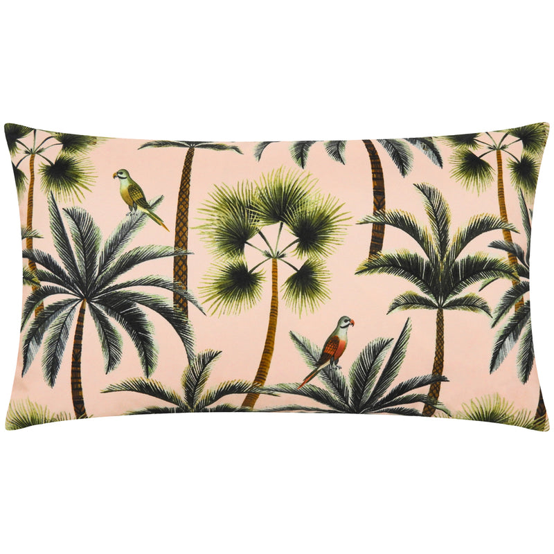
accents.
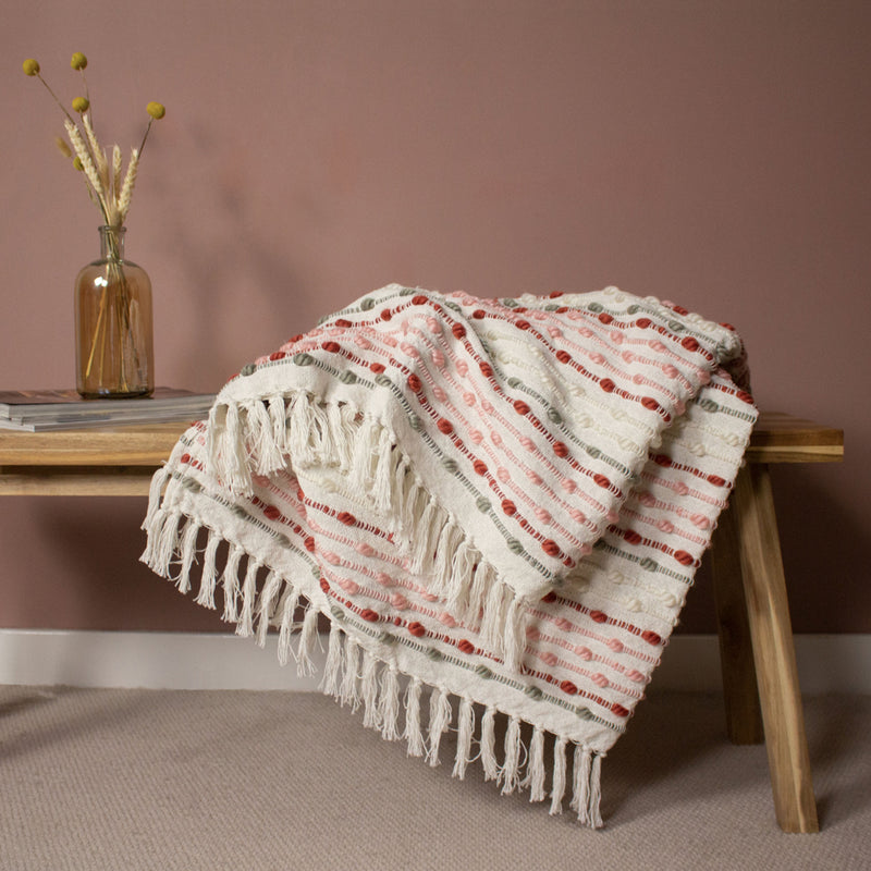
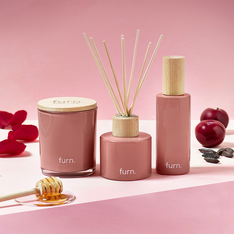
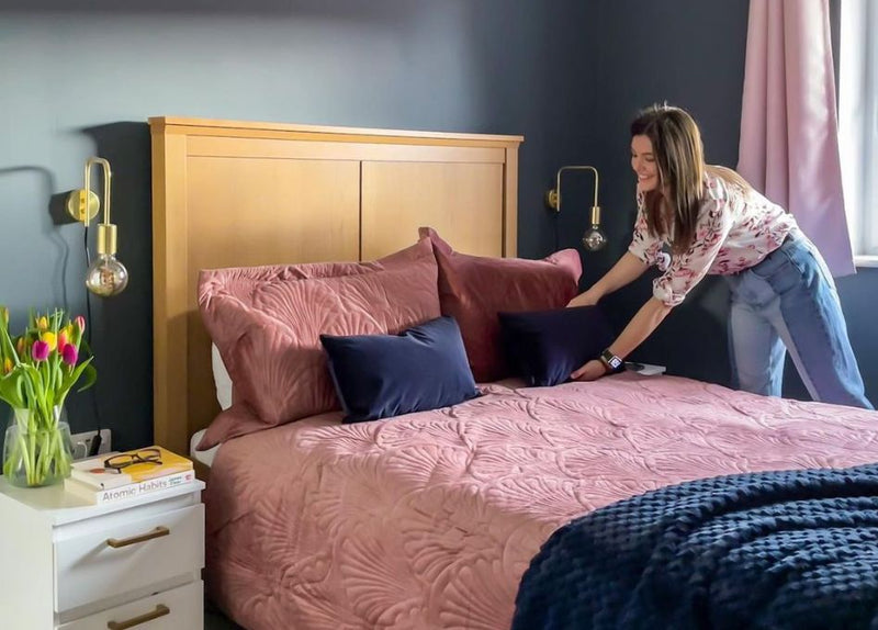
If using pink doesn’t come naturally to you, then introduce it slowly through smaller pieces like pink cushions and pink throws. They’re easy to add in and take away, as well as move around the home to find the perfect pink spot.
adorn the walls.
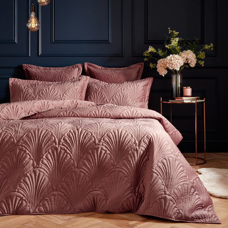
Ready go bigger? Pink is super flattering for dressing rooms and bathrooms, as it gives you that rosy glow. It makes bedrooms romantic and living rooms calming – what’s not to love? Add in beautiful pattern with pink wallpaper.
upgrade your window.
Pink is a beautiful colour to add to your window. Whether you add a pop of vibrancy with hot pink curtains or go subtle with blush, there’s always a way to freshen up your windows with pink. Go girly with layers of sheer fabrics, or keep it bold with block colour.
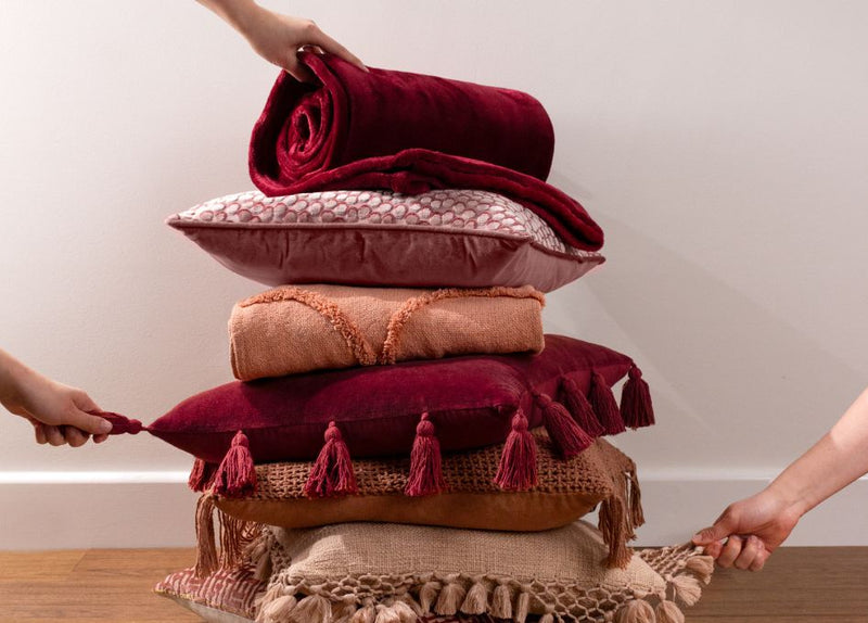
don’t forget about texture.
Pink is playful – and the types of materials you use can add to the style you’re creating. You might use fluffy faux fur cushions to create a light and airy candyfloss feeling, or something plush like velvet to up the luxe.
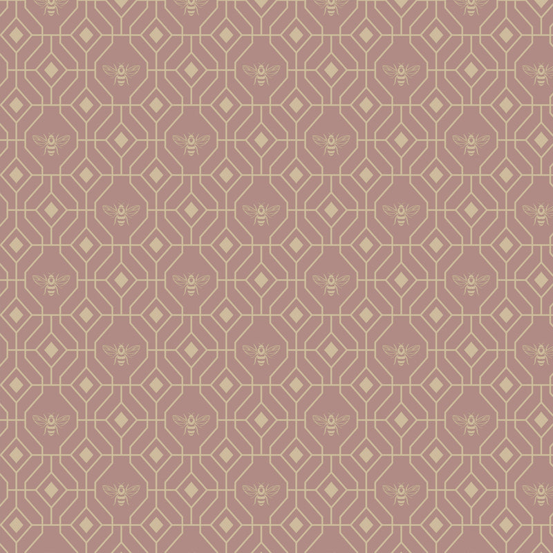
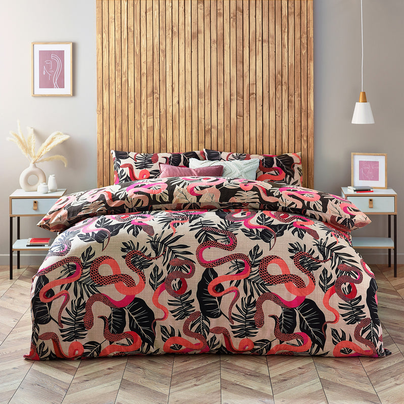
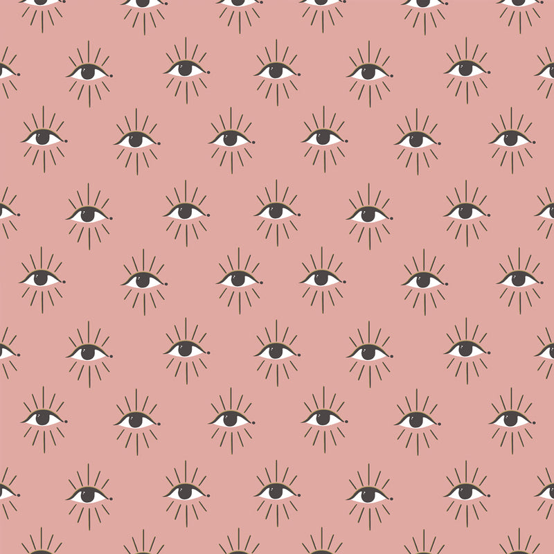
keep it fresh with pattern.
If you’re concerned that using pink will make your space too girly, then pair your pink with a modern pattern. Something geometric, abstract or bold will keep pink looking fresh and contemporary. Classic patterns like stripes are always a winner too.
layer up.
The beauty of pink is that you don’t have to stick to one shade – layer up on different shades of pink for a fun, playful feel. You might use blush pink on the walls and hot pink as your accent. Avoid other feminine clichés like florals and ruffles to keep it from being overwhelming.
shop the looks